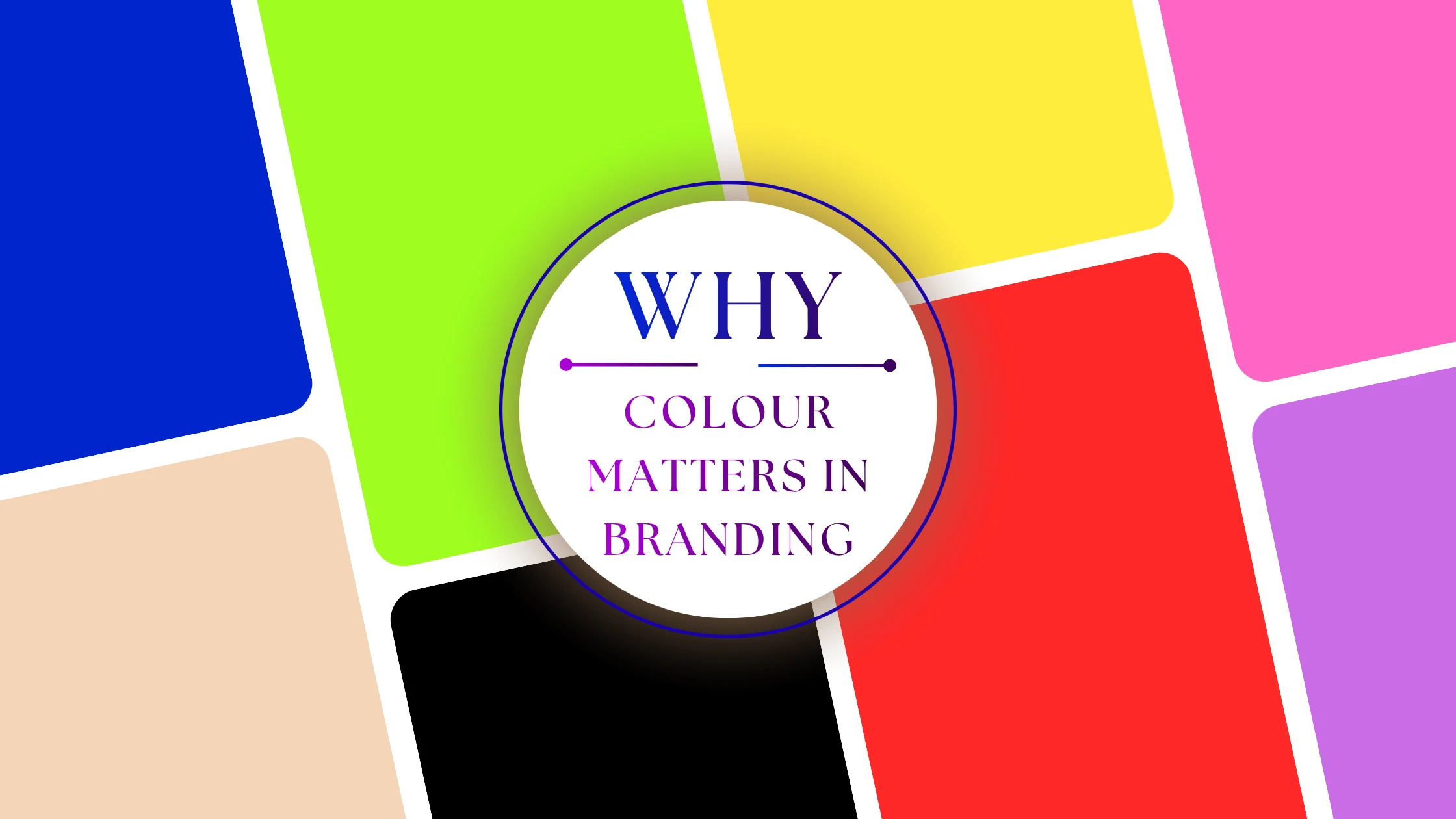
Colour Psychology in South African Branding
Colour is one of the fastest ways to shape how people feel about your brand. Before someone reads your slogan or understands your service, they often notice colour first. Used well, colour can help your business feel trustworthy, modern, calm, energetic or premium. Used poorly, it can make your brand feel confusing, cheap or inconsistent. Brand colour choices work best when they reflect your goals, your audience and the context in which people will see the brand.
For South African businesses, this matters even more because your brand may need to work across different audiences, languages, industries and channels. A colour palette that works for a corporate law firm will not always work for a café, a youth brand or a local service company. The best result usually comes from choosing a small, deliberate palette and using it consistently across your logo, website, social media and print materials.
Why Colour Matters in Branding?
Colours do more than look pretty, they can help communicate emotions, brand values as well as your brands identity faster than words. Whether you’re launching a startup in the heart of Cape Town or refreshing your Pretoria based NGO’s look, understanding colour psychology is essential. This post breaks down what key colours represent in South African cultural and business contexts and shows how to use them effectively in your branding.
-
Instant Emotional Connection:
- Differentiation:
- Industry Expectations:
- Cultural Context:
Colours can trigger peoples subconscious feelings like (trust, excitement, calm etc…).
Helps your brand stand out in a crowded industry space.
Certain sectors use specific colour palettes due to industry norms and to meet general perceptions of their industries (e.g., green for eco focused businesses, gold for luxury goods and services based businesses).
In South Africa, colours like green or a maize yellow tends to carry localized relevance to consumers.
Blue: Trust, Professionalism & Stability
Blue is often associated with trust, calm, reliability and professionalism. That makes it a common choice for businesses that want to feel dependable and well organised.
Best suited to
Finance, professional services, healthcare, technology, logistics and corporate brands.
How to use it well
Use navy or deep blue for your core brand colour if you want a serious, stable feel. Lighter blues can be used as accents for a more open and modern look. Blue works especially well when paired with white, grey or soft neutrals.
Watch out for
Too much blue can feel cold or overly corporate, so it helps to warm it up with a secondary accent colour or more human imagery.
Notable South African Brands:
Standard Bank – Deep blue for authority and reliability
Blue Label Telecoms – Trust and technological clarity
Protea Hotels – Corporate calm in the hospitality space
Design Tip: Use a navy or royal blue as your base. Accent with sky or steel blue for a modern feel.

Green: Growth, Nature & Wellness
Green is commonly linked to growth, renewal, nature and balance. It can also suggest freshness, sustainability and wellbeing.
Best suited to
Wellness businesses, agriculture, eco-friendly brands, natural products, food, lifestyle brands and some financial services.
How to use it well
Earthy greens feel grounded and authentic. Brighter greens feel fresh and energetic. Green can be paired with cream, brown, charcoal or dark blue depending on whether you want the brand to feel natural, premium or practical.
Watch out for
Very bright greens can feel artificial if the rest of the brand is soft or traditional, so match the tone of the green to the rest of the design.
Notable South African Brands:
Food Lover’s Market – Freshness and natural produce
Nedbank – Sustainable finance and eco-friendly initiatives
FNB – Bright green evokes approachability and innovation
Design Tip: Combine green with earthy browns or neutrals to suggest authenticity and sustainability.

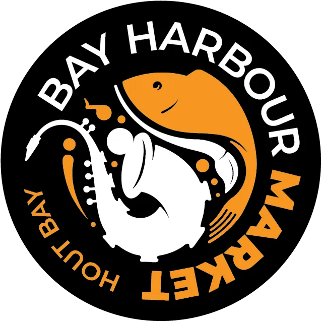
Red: Energy, Urgency & Passion
Red is bold, attention-grabbing and emotionally strong. It can create a sense of energy, appetite, urgency or power.
Best suited to
Food, fitness, entertainment, promotions, hospitality and campaign-led brands.
How to use it well
Use red as an accent rather than the only colour if you want it to feel sophisticated. Small amounts of red can be very effective for buttons, highlights or key brand moments.
Watch out for
Too much red can feel aggressive or overwhelming, so it is usually better in smaller doses.
Notable South African Brands:
Nando’s – Bold red, fiery passion, vibrant food culture
Vodacom – Energy, dominance in communication
South African Breweries (SAB) – Tradition and dynamism
Design Tip: Use red as an accent colour—too much can feel aggressive or overwhelming.
Yellow & Gold: Optimism & Luxury
Yellow and gold are often associated with warmth, joy, sunshine, creativity and luxury. The exact tone matters a lot here.
Best suited to
Retail, hospitality, premium products, events, food and service brands that want to feel friendly or celebratory.
How to use it well
Soft gold, mustard or champagne tones usually feel more refined than bright primary yellow. Gold pairs well with black, white, navy or dark green for a more polished look.
Watch out for
Bright yellow can be difficult to read on light backgrounds, so use it carefully and make sure it still works visually across web and print.
Notable South African Brands:
Mugg & Bean – Warmth and comfort
Tsogo Sun – Premium gold tones signify indulgence
Proudly South African – Sunshine yellow reflecting national pride
Design Tip: Mustard or champagne gold tones feel more premium than bright primary yellow.


Black, Gray & White: Simplicity & Sophistication
Monochrome palettes can feel clean, modern, elegant and premium. They are popular because they are flexible and easy to apply across different brand assets.
Best suited to
Luxury services, fashion, architecture, design, corporate brands and minimal businesses.
How to use it well
Black and white creates strong contrast and a timeless look. Grey can soften the palette and keep it feeling more contemporary. A single accent colour, such as gold, blue or red, can make the brand feel more distinctive.
Watch out for
A monochrome brand can feel flat if there is no texture, photography style or accent treatment to bring it to life.
Notable South African Brands:
Woolworths – Black and white for timeless retail appeal
South African Tourism – Clean, versatile visual tone
Orlando Pirates – Bold monochrome to signal power and loyalty
Design Tip: Use a monochrome palette for a high-end look; add metallics (silver or gold) for extra flair.

Earthy Tones: Local, Grounded, Authentic
Earth tones usually include browns, terracotta, clay, beige, muted olive and warm neutrals. They often feel grounded, handmade and familiar.
Best suited to
Artisan products, natural brands, cultural businesses, interior design, hospitality and brands that want to feel local and authentic.
How to use it well
Earth tones work best with textured imagery, simple layouts and soft off-white backgrounds. They feel especially effective when paired with natural materials, product photography or heritage-led storytelling.
Watch out for
If the palette is too muddy, the brand can feel dated. Keep the tones rich and intentional rather than dull.
Notable South African Brands:
Rooibos Ltd. – Terracotta red symbolising nature and health
Hout Bay Trading Co. – Rustic, grounded palette for artisan appeal
Khumba Energy – Natural tones reinforcing sustainability
Design Tip: Use textured backgrounds or off-whites with earth tones for a natural, tactile feel.
How to choose the right colour for your brand?
Choosing colours is not just about personal taste. It should be a deliberate decision based on your audience, your industry and the feeling you want the brand to create. That approach is supported by current branding guidance, which recommends starting with your emotional goals, then matching colours to that positioning rather than picking shades at random.
Ask what you want people to feel when they see your brand. Calm, premium, friendly, bold, dependable, creative or modern are all valid starting points.
Some industries have strong visual expectations. That does not mean you must copy them, but it does help to know what your audience already recognises and trusts.
Different age groups, industries and communities respond differently to colour. There is no single universal meaning for every audience, which is why context matters so much
A strong brand usually works better with one or two main colours and one or two accent colours than with too many competing shades.
Check how the palette looks on your logo, website, business cards, social media templates and printed items. A colour that looks good on screen may feel very different on paper or on a phone display.
Your colour choices must still be readable and easy to use. WCAG recommends sufficient contrast between text and background, with a minimum contrast ratio of 4.5:1 for normal text. That matters for buttons, headings, forms and any text placed over colour blocks or images.
A simple colour strategy for small businesses
If you are not sure where to begin, use this formula:
- one main brand colour
- one supporting colour
- one accent colour
- one neutral base colour
That gives you enough flexibility to look consistent without making the brand feel messy. It also makes it much easier to build a website, social templates and print material that all feel like part of the same business.
Colour Psychology Cheat Sheet
| Colour | Common associations | Often used in |
|---|---|---|
| Blue | Trust, professionalism, stability | Finance, health, tech, corporate services |
| Green | Growth, nature, balance, wellbeing | Agriculture, wellness, sustainability, food |
| Red | Energy, urgency, passion, appetite | Food, fitness, promotions, entertainment |
| Yellow and gold | Warmth, optimism, value, luxury | Retail, hospitality, events, premium brands |
| Black, grey and white | Simplicity, elegance, clarity, modernity | Luxury, architecture, fashion, design |
| Earth tones | Warmth, authenticity, craft, heritage | Artisan brands, local products, culture, interiors |
What to avoid?
A lot of colour advice online sounds confident, but it can be too broad. For a business brand, the goal is not to choose the “correct” colour in theory. It is to choose the colour that fits your audience, your market and the way you want to be remembered. Strong branding comes from consistency, good spacing, readable typography and a palette that is used with intention
Ready to build a brand that feels right?
If you want your colours to do more than just look nice, the next step is building a brand system that uses them properly across your logo, website, social posts and print design. That is where colour starts working as part of the business, not just the decoration.